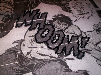
I decided to work on the words first because (1) they are in the (relative) middle of the picture and that way I wouldn't be leaning across what I had worked on (it isn't nice to lean on many hundreds of bits of cut glass) and (2) I thought that it would be hard to mess up words and that that would be a good way to get comfortable with the picture. So here is the outlined WHOOM!
After letting it set for a day, I got right into filling in the blue of the letters. Since the letters have a "shaky" font, I broke up the blue pieces unevenly so each lettter would look a bit like a smashed windscreen glass.
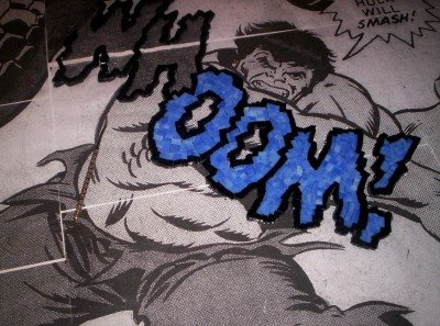
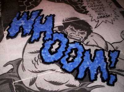
Here's the whole WHOOM!
And here is the finished BUH. I only noticed after getting ready to outline the BUH that the WHOOM and BUH have completely different font styles. So I tried to keep the pieces in keeping with this font and cut the pieces as regularly as I could, so the BUH would be more even and tidy.
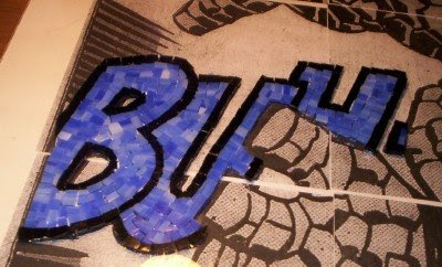
I'm surprised how really nice the black glass looks. I didn't think creating the outlines would make it look so much better, but it really does. The black glass is completely opaque and really shiny. (It is also a pisser to cut and, since there is SO MUCH BLACK in this piece, since everything has thick outlines, this is going to get tedious--very, very tedious.)

 After letting it set for a day, I got right into filling in the blue of the letters. Since the letters have a "shaky" font, I broke up the blue pieces unevenly so each lettter would look a bit like a smashed windscreen glass.
 Here's the whole WHOOM!
 And here is the finished BUH. I only noticed after getting ready to outline the BUH that the WHOOM and BUH have completely different font styles. So I tried to keep the pieces in keeping with this font and cut the pieces as regularly as I could, so the BUH would be more even and tidy.
 I'm surprised how really nice the black glass looks. I didn't think creating the outlines would make it look so much better, but it really does. The black glass is completely opaque and really shiny. (It is also a pisser to cut and, since there is SO MUCH BLACK in this piece, since everything has thick outlines, this is going to get tedious--very, very tedious.)
No comments:
Post a Comment